Candlestick patterns: how to read them on crypto charts
Japanese candlesticks show how price moved over a chosen period and which side, buyers or sellers, had the upper hand. This article explains how a candle is built, covers the most common one-, two- and three-candle patterns and shows them on four real Binance charts. The key idea is simple: a pattern without context is only a hint.
What a Japanese candlestick is: body, wicks and four prices
You will find a candlestick chart on almost every crypto exchange. The idea is traced back to 18th-century Japanese rice trading, which is why the candles are called Japanese, and in the West they were popularised by Steve Nison's 1991 book. If you are opening a chart for the first time, start with the basics of technical analysis.
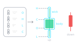
Each candle sums up one period of time: 15 minutes, an hour, 4 hours or a day. Drawing it takes four prices (OHLC): the open, the high, the low and the close.
- The body shows the distance between the open and the close. If the close is above the open, the candle is bullish (usually green); if it is below, the candle is bearish (red).
- Wicks (also called shadows) show where price went but could not hold. A long lower wick means lower prices were rejected; a long upper wick means higher prices were rejected.
- The ratio of body to wicks matters more than their absolute size. A common rule: a wick counts as long when it is at least twice the length of the body.
Example: one ETH daily candle
According to Binance data, the ETH/USDT daily candle on 13 January 2025 opened at 3,267.30, rose as high as 3,339.00, fell as low as 2,920.00 and closed at 3,137.51 USDT. The close was below the open, so the body is red and 129.79 USDT long. The lower wick measures 217.51 USDT, almost 1.7 times the length of the body: that day sellers pushed price below 3,000, but by the close buyers had won back more than half of the drop.
On the 4-hour (4H) chart the same day is made up of six candles, and the last of them is the bullish engulfing pattern we look at below. So always check which timeframe you are reading.
The crypto market trades around the clock. The Binance daily candle closes at 00:00 UTC, so convert that to your own time zone (in Lithuania, for example, it is 02:00 in winter and 03:00 in summer). Until the candle has closed, there is no pattern yet: in the final hour a hammer can still turn into an ordinary bearish candle.
Context matters more than shape: three questions
A candlestick pattern (sometimes called a candlestick formation) is one, two or three candles whose shape shows who won a short battle between buyers and sellers. The same shape can mean a lot on one chart and almost nothing on another. So before you name a pattern, answer three questions.
- What was the trend? A reversal pattern only makes sense after a clear move. A hammer after three weeks of decline and a hammer in the middle of a sideways market are different things.
- Is price at a level? A pattern at a support or resistance level, a previous low or a round number has a clear reference point from which risk can be measured. A pattern “in mid-air” has no such point.
- What does volume show? Higher than usual trading volume shows that many trades went into the candle. If volume is several times the 20-candle average, say 3-5 times, it is clearly unusual.
Add confirmation to these three questions. Many traders only take a pattern into account once the next candle closes in its direction, for example when the candle after a hammer closes above the hammer's body. This gives up part of the move but filters out some false patterns.
Single-candle patterns
Doji: indecision
A doji candle opens and closes at almost the same price, so it has almost no body. It is a balance: over that period neither buyers nor sellers won. After a long rise a doji shows that buying pressure is fading, but on its own it is no reason to assume that price will fall. There are two more distinctive variants: the dragonfly doji with a long lower wick and the gravestone doji with a long upper wick.
Hammer and hanging man: same shape, different place
Both candles have a small body near the top and a long lower wick, at least twice the length of the body. A hammer appears after a decline: sellers pushed price down, but buyers brought it back. A hanging man appears after a rise: price recovered by the close, but during the period sellers managed to push it down hard. It is the first sign that selling pressure is building. The shape is the same; the meaning depends on the trend that came before it.

According to Binance data, XRP/USDT rose in two weeks from 2.0836 (the open on 1 January) to 3.40 (16 January), an increase of 63%. On 18 January a hanging man formed: its lower wick was 9.4 times the length of its body, and volume was 1.2 times the 20-day average. Confirmation came the next day: the candle closed at 2.9587, not only below the hanging man's body but also below the bottom of its wick (3.058), on volume 1.7 times the average. By 1 February price had not returned to the 3.40 high.
Note what happened on 20 January: price spiked once more, to 3.3695. If someone had opened a short position (one that gains when price falls) after the confirmation, a stop-loss order placed just above the hanging man's high (3.2996) would have been triggered, while a stop above the earlier 3.40 high would have survived. A pattern can hint at direction, but levels decide where the stop goes. We cover this in more detail in our risk management article.
Inverted hammer and shooting star
This is the mirror image of the hammer: a small body near the bottom and a long upper wick. After a rise such a candle is called a shooting star: buyers tried to lift price but gave back almost the entire gain by the close. After a decline the same shape is called an inverted hammer. It is considered a weaker hint, because it only shows an attempt to rise, not a rejected decline.
Marubozu and spinning top
A marubozu is a candle with almost no wicks: one side was in control for the whole period. It more often shows strength in the direction of the move than a reversal. A spinning top has a small body in the middle and wicks on both sides. It is a battle with no winner, so a spinning top tells you nothing on its own until you know where on the chart it appeared.
Two-candle patterns
Engulfing pattern
A bullish engulfing pattern forms when the body of a bullish candle completely covers the body of the previous bearish candle. A bearish engulfing pattern is the reverse: the body of a large bearish candle covers the body of the previous bullish candle. It is one of the clearest two-candle patterns, because within a single period the initiative passes to the other side. In crypto a new candle usually opens at the previous close, so in practice what matters most is whether the second candle closes above the first candle's open (below it, for a bearish engulfing).

This example shows the full context. According to Binance data, in one week ETH/USDT fell from 3,744.83 (6 January) to 2,920.00, a drop of 22.0%. The low came on the 12:00 UTC candle on 2025-01-13: price fell well below the 20 December 2024 low (3,101.90) and the round 3,000 level, but the candle closed back above 3,000, at 3,049.00. Its volume was 5.9 times the 20-candle average. When price briefly breaks through a clear level and quickly comes back, this is called a liquidity sweep.
After one small red candle, the next candle, starting at 20:00 UTC, opened at 3,025.06, closed at 3,137.51 (+3.7%) and engulfed the previous candle's body. Price was back above the December low, and over the next two days it rose to 3,473.75. The engulfing candle itself was nothing special: its volume was only 1.5 times the average. What gave it weight was its location: a rejected break below the previous low and the huge volume just before it.
Harami, tweezers and piercing line
- Harami: the body of a small candle fits inside the body of the previous large candle. The pattern shows that the move is slowing down, but not yet that it has reversed. Many traders treat a harami as a warning and wait for the next candle.
- Tweezers: two candles with almost identical lows (tweezer bottom) or highs (tweezer top). Price was turned back at the same level twice in a row.
- Piercing line and its opposite, dark cloud cover: the second candle recovers more than half of the previous candle's body. It is a milder version of the engulfing pattern.
Three-candle patterns
Morning star and evening star
A morning star consists of a large bearish candle, a small candle (this is the “star”) and a bullish candle that closes above the midpoint of the first candle's body. An evening star is its mirror image at a top. In the classic definition there is a price gap between the body of the star and the bodies of the candles on either side. The crypto market trades without breaks, so such gaps are rare, and the pattern is identified by the size of the bodies and the closes.

According to Binance data, from 26 January to 6 February 2026 XRP/USDT fell from 1.946 to 1.1172, a drop of 42.6%. Price had not been this low for almost 15 months, since November 2024. The first candle (16:00 UTC on 2026-02-05) fell from 1.2967 to 1.2135. The second candle had almost no body, and its volume was nearly 5 times the 20-candle average. The third closed at 1.2698, above the midpoint of the first candle's body (1.2551). Over the next 12 hours price reached 1.5442, 21.6% above the third candle's close.
The pattern was not a textbook one: the third candle first dipped below the star's low (to 1.1172), and its body is smaller than that of the first candle. But the context was striking: a deep decline, the lowest price in almost 15 months and unusually high volume. Later price gave back part of the rise and on 9 February had fallen to 1.3728, but it did not return to the pattern's low (1.1172) before 10 February.
Three white soldiers and three black crows
Three strong bullish candles in a row, each closing above the previous one, are called three white soldiers. The opposite pattern, three black crows, is three strong bearish candles. Both show a clear advantage for one side, but they have a practical drawback: by the time the pattern has formed, price is usually far from the nearest level.
For example, according to Binance data, three bullish candles on the DOT/USDT daily chart on 8-10 May 2025 lifted price from 3.968 to 5.309, a rise of 33.8%. A stop below the first candle's low (3.966) would have been 25.3% below the last close, and over the next five days price gave back 10% and closed at 4.779 on 15 May.
When a textbook pattern fails
A textbook shape does not guarantee a move. According to Binance data, an almost perfect dragonfly doji formed on the ADA/USDT daily chart on 3 February 2025: the body was 2.2% of the candle's full range and the lower wick 93.9%. Price had dropped as low as 0.506 and closed at 0.812, on volume 5.9 times the 20-day average. It looks like a bottom straight out of a textbook.

But confirmation never came. The next candle closed at 0.7439, 8.4% lower, and on 9 February price fell to 0.6503, 19.9% below the doji's close. Up to 20 February ADA did not close above 0.812 even once. The bottom of the wick held, but anyone who had bought at the doji's close on the candle's shape alone would have been about 20% down six days later.
Why could this happen? On the same day long lower wicks formed on the daily charts of most major coins: ETH's wick was 93.6% of the candle's range, DOT's 91.7%, XRP's 80.1% and LINK's 76.2%, and their volume was 4-5 times the 20-day average. When the whole market moves together, one coin's candle says more about the mood of the whole market than about that coin's buyers.
Candlestick patterns cheat sheet
The table lists the most common patterns, where they are most meaningful and what traders most often treat as confirmation.
| Pattern | Candles | Where it matters most | What counts as confirmation |
|---|---|---|---|
| Hammer | 1 | After a decline, at support | The next candle closes above the hammer's body |
| Hanging man | 1 | After a rise, at resistance | The next candle closes below its body |
| Shooting star | 1 | After a rise, at resistance | The next candle closes below its body |
| Inverted hammer | 1 | After a decline, at support | The next candle closes above its body |
| Doji | 1 | After a long move | Direction and close of the next candle |
| Marubozu | 1 | On a breakout from a sideways market | Price holds beyond the broken level |
| Bullish engulfing | 2 | After a decline, at support | Price holds above the engulfing candle's low |
| Bearish engulfing | 2 | After a rise, at resistance | Price holds below the engulfing candle's high |
| Harami | 2 | After a strong move | Price breaks out of the large candle's range |
| Tweezer bottom or top | 2 | At a clear level | The next candle moves away from the level |
| Morning star | 3 | After a decline | The third candle closes above the midpoint of the first candle's body |
| Evening star | 3 | After a rise | The third candle closes below the midpoint of the first candle's body |
| Three white soldiers, three black crows | 3 | Soldiers after a decline or sideways market, crows after a rise or sideways market | The following candles do not give back most of the move |
Candlestick patterns describe one, two or three candles. Larger figures that take dozens of candles to form (head and shoulders, triangles, flags) are covered in our chart patterns article.
The six most common mistakes
- Reading a pattern before the candle has closed. In the final hour a hammer can still become an ordinary bearish candle.
- Looking for patterns on 1-5 minute charts. There are a great many of them there, and a large share is random noise.
- Ignoring the trend. A single bullish candle in the middle of a strong decline may be nothing more than a pause.
- Forgetting about volume. A pattern on lower than usual volume was backed by few trades, so it is less reliable.
- Placing the stop too close. As the XRP example shows, price can test the edge of the pattern again. Levels and the risk-to-reward ratio decide where the stop goes, not the candle alone.
- Judging an altcoin without looking at BTC. The 3 February 2025 example showed that the whole market can produce the same pattern at the same time.
How to learn to spot the patterns
You can learn the definitions in an evening, but training your eye takes weeks. The simplest method: open a historical chart, cover its right-hand side, decide whether you see a pattern and whether it has context, and only then look at what happened next. Write down every decision so you can see where you go wrong most often.
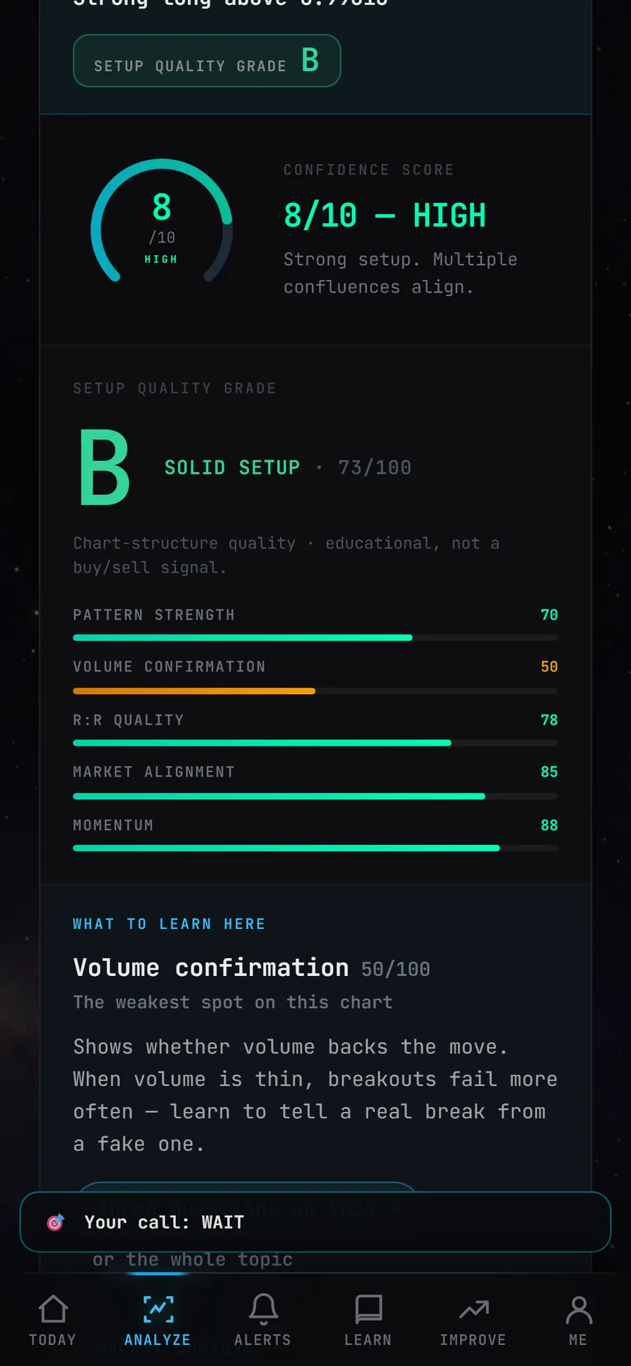
For this, the Skenuok app has a 54-pattern library built on real Binance charts and a daily “Guess before the AI” drill that tracks your accuracy and streak. The AI chart scanner rates not only pattern strength but also volume confirmation, market alignment and momentum, and it names the weakest spot on the chart separately.
Frequently asked questions
Which candlestick patterns are considered the strongest?
Do candlestick patterns work in crypto?
Which timeframe works best for candlestick patterns?
What is the difference between a hammer and a hanging man?
Can you trade on candlestick patterns alone?
The best way to learn patterns is to see them many times on real charts: for exactly that, the Skenuok app has a 54-pattern library built on real Binance charts and the daily “Guess before the AI” drill.