Crypto technical analysis: how to read crypto charts
Technical analysis is a way of reading a price chart: seeing where the market has already reacted, whether buyers or sellers currently have the upper hand, and where your idea stops being valid. This guide moves from timeframes and candles to trend, levels, volume and indicators, and ends with a 7-step routine you can use on any crypto chart. Every price chart in the guide is built from real Binance BTC/USDT data.
What technical analysis is and what it does not do
Technical analysis (TA) looks only at what the market itself shows: price, how it moves over time and trading volume. The premise is simple: price reflects what buyers and sellers are doing, and people in similar situations often behave in similar ways. That is why some pictures repeat on a chart: a decline stalls more than once near the same price, a rally gets stuck at a previous high.
Fundamental analysis asks different questions: what the project does, how many coins have been issued, who holds them, what the news is. The two approaches do not cancel each other out, and they can be combined. This guide is about technical analysis: the chart is what you see every time you open an exchange, and it is also the easiest thing to misread.
What technical analysis gives you
- Structure: whether price is rising, falling or moving sideways with no clear direction.
- Key areas: prices where the market has already reacted and may react again.
- An invalidation point: the price at which your scenario no longer holds. Without it there is no risk management.
What it does not do
It does not predict the future and it does not guarantee an outcome. A chart helps you weigh possible scenarios, but it does not show which one will play out. Unexpected news, an exchange outage or a single large seller can undo even a very clean picture within minutes. So for every technical scenario it is worth answering one question in advance: what will I do if I am wrong?
Timeframes: the same coin, a different picture
A timeframe tells you how much time one candle covers. Crypto trades around the clock with no days off, so where a day starts on a chart is a matter of convention. On Binance the daily candle opens at 00:00 UTC, so it is worth checking what time that is where you live.
| Timeframe | One candle | Candles per day | Most common use |
|---|---|---|---|
| 15 min | 15 minutes | 96 | Very short trades. A lot of random noise. |
| 1 hour (1H) | 1 hour | 24 | Fine-tuning the entry. |
| 4 hours (4H) | 4 hours | 6 | Trades lasting a few days, clearer levels. |
| 1 day (1D) | 1 day | 1 | Main direction and the most important levels. |
| 1 week (1W) | 7 days | 1 every 7 days | Long-term view and major market cycles. |
For a beginner it is usually easiest to start with the daily (1D) and 4-hour (4H) charts. On lower timeframes every swing looks like a major event, even though in the bigger picture it is just a detail. The usual sequence is this: you first establish the direction on a higher timeframe, then look for a more precise entry on a lower one. This is called multi-timeframe analysis.
Japanese candlesticks: four prices in one
Each candle shows four prices for its period: the open, the high, the low and the close. The thick part is called the body: it is drawn between the open and the close. The thin lines above and below the body are called wicks: they show how far price travelled but could not hold. A green candle means the close was higher than the open, a red one that it was lower.
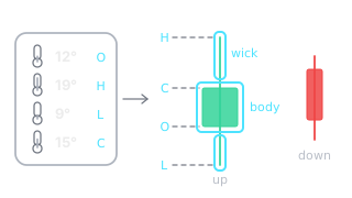
A real example: the BTC/USDT daily candle on 11 September 2026. Open 76,569, high 79,890, low 76,047, close 77,226 USDT. The body is small, only 657 USDT, while the upper wick reaches 2,664 USDT. In other words, during the day buyers pushed price more than 4% above the open, but by the close sellers had erased most of that rise.

That is the whole point of timeframes: the same move looks like a sharp rise and fall on the 1-hour chart and like just a wick on the daily chart. We cover candle types and the most common patterns in more detail in Candlestick patterns.
Trend: highs and lows
A trend is the overall direction of price. It is more reliable to read it from highs and lows than from a gut feeling:
- Uptrend: each new high is above the previous high and each low is above the previous low (higher high, HH, and higher low, HL).
- Downtrend: highs and lows keep getting lower (lower high, LH, and lower low, LL).
- Sideways: price swings between two levels and neither side takes control.

An example from autumn 2024. On 6 September BTC fell to 52,550 USDT, and on 27 September it rose to 66,498. The next decline, on 10 October, stopped at 58,946, well above the previous low. After that the chart shows a high of 69,520 (21 October), a low of 65,260 (23 October), a high of 73,620 (29 October) and a low of 66,835 (4 November). Each high is above the previous high and each low is above the previous low: that is a rising structure.
As long as price holds above the last higher low, the rising structure is considered intact. If a daily candle closed below it, in this case below 66,835, that would be the first sign that the structure is breaking. This time the opposite happened: on 6 November the daily candle closed at 75,572, above the previous high. This is an explanation in hindsight, not a guarantee: next time the same structure may break.
When a trend pauses or reverses, recognisable shapes often form on the chart: triangles, flags, double tops. We cover them in Chart patterns.
Support and resistance: zones, not lines
Support is a price area where declines have stalled more than once before because buyers stepped in. Resistance is an area where rallies have stalled because sellers stepped in. In practice it is almost always a zone, not a single number: price rarely turns at exactly the same spot.

A real example. From 5 June to 18 August 2026, BTC moved roughly between 57,800 and 67,300 USDT. At the bottom, declines stopped three times in a similar place: at 59,131 (5 June), 58,115 (25 June) and 57,800 (1 July). At the top, rallies stalled at 67,292 (15 June), 66,956 (21 July) and 65,745 (27 July). The highest daily close over that whole period was 66,556, so not a single daily candle closed above the resistance zone.
Beginners often draw a line through a single point. It is more useful to mark a zone from the lowest to the highest reaction point and treat it as one area. The more times price has reacted to a zone, and the higher the timeframe on which you can see it, the more likely it is that many market participants are watching it. When a daily candle closes beyond the zone, that is called a breakout. After a breakout, former resistance often becomes support, and vice versa. You will find how to draw zones and spot a false breakout in Support and resistance levels.
Trading volume: is anyone backing the move?
Trading volume shows how many coins changed hands during one candle. It is displayed as bars below the price candles. Keep in mind that an exchange chart shows only that exchange's trades, so volume differs from one exchange to another.
In the previous example, over the 20 days before the breakout an average of about 11,500 BTC changed hands per day in the BTC/USDT pair on Binance. On the breakout day, 19 August, volume reached 29,054 BTC, and on the next two days 35,905 and 44,340 BTC. Price did not leave the zone quietly: trading was 2.5-3.9 times more active than usual.
Volume guarantees nothing, but it helps tell two pictures apart. A breakout on high volume shows that many buyers and sellers are taking part in the move. A breakout on low volume is considered less reliable: such a move often turns into a false breakout (fakeout), where price briefly crosses the level and then comes back.
Indicators: helpers, not decision makers
A technical indicator is a formula that calculates an extra line or number from price or volume. Almost all indicators are calculated from past prices, so they lag: they describe what has already happened, not what will happen. An indicator does not replace structure and levels. It can only confirm what you already see or raise a doubt.
| Indicator | What it shows | Common settings | Common mistake |
|---|---|---|---|
| Moving average (MA, SMA, EMA) | The average price over a chosen period and the overall direction | 20, 50 and 200 periods | Reacting to every crossover of price and the average in a sideways market |
| RSI | The strength of price movement (momentum) on a scale from 0 to 100 | 14 periods, thresholds at 70 and 30 | Assuming that above 70 price must fall, even though in a strong trend RSI can stay above 70 for a long time |
| MACD | The difference between two exponential moving averages and its direction | 12, 26 and 9 periods | Treating every line crossover as a sign, even though it often happens after much of the move is already over |
| Volume | How actively the asset is being traded | Bars below the chart, sometimes with a 20-period average | Judging volume without comparing it with its usual level |
A practical rule for beginners: at first, volume and one indicator are enough, for example RSI or the 50-day moving average. Five indicators on screen often show the same thing in different colours and create a false sense of certainty.
How to read a crypto chart: a 7-step routine
This routine works for any pair and any timeframe. For at least the first few months it is worth doing it in writing: that way you will later see where your reading held up and where it did not.
- The bigger picture. Open the daily (1D) chart and look 3-6 months back. Where in that period's range is price now: near the top, near the bottom or in the middle?
- Trend. Write down the last two highs and the last two lows. Are they rising, falling or staying flat?
- Zones. Mark the 2-3 most important zones where price has stalled more than once. You do not need more.
- Location. Check whether price is now near a zone or in the middle between zones. In the middle it is hardest to find a clear invalidation point: both zones are far away, so the stop would be far from the entry.
- Volume and one indicator. Was the last move accompanied by higher volume? What do RSI or the moving average show? If they contradict the structure, that is a reason to be more cautious.
- Lower timeframe. Switch to 4H or 1H and look for confirmation, for example a candle that closes beyond the level rather than just touching it with a wick.
- A scenario with numbers. Write down where the idea stops being valid: that is usually where the stop loss order goes. Also write down the first target and the risk to reward ratio (R:R). For example: entry 100, stop 95, target 110. Risk 5, potential profit 10, ratio 1:2.
If any step has no clear answer, waiting is also a decision. An unclear chart is not a mistake to be fixed with one more indicator. It is simply a chart you can leave alone today.
In risk management, position size is usually calculated not from how confident you are, but from how much you are willing to lose if the stop is hit. For example, with €1,000 in the account and 1% risk allowed per trade, that is €10. With the stop 5% from the entry, the position would be €200: if the stop is hit you would lose about €10, not counting fees and slippage. More on this in Risk management and stop loss.
What this routine looks like in the Skenuok app
In the Skenuok app, the AI chart scanner runs a similar routine on a chart you upload: it marks the structure and levels, gives a setup quality grade and a confidence score, and separately shows a plan with a stop loss, targets and an invalidation rule. Below is a real example: a scan of a DOT/USDT 4-hour chart, data from 7 September 2026.
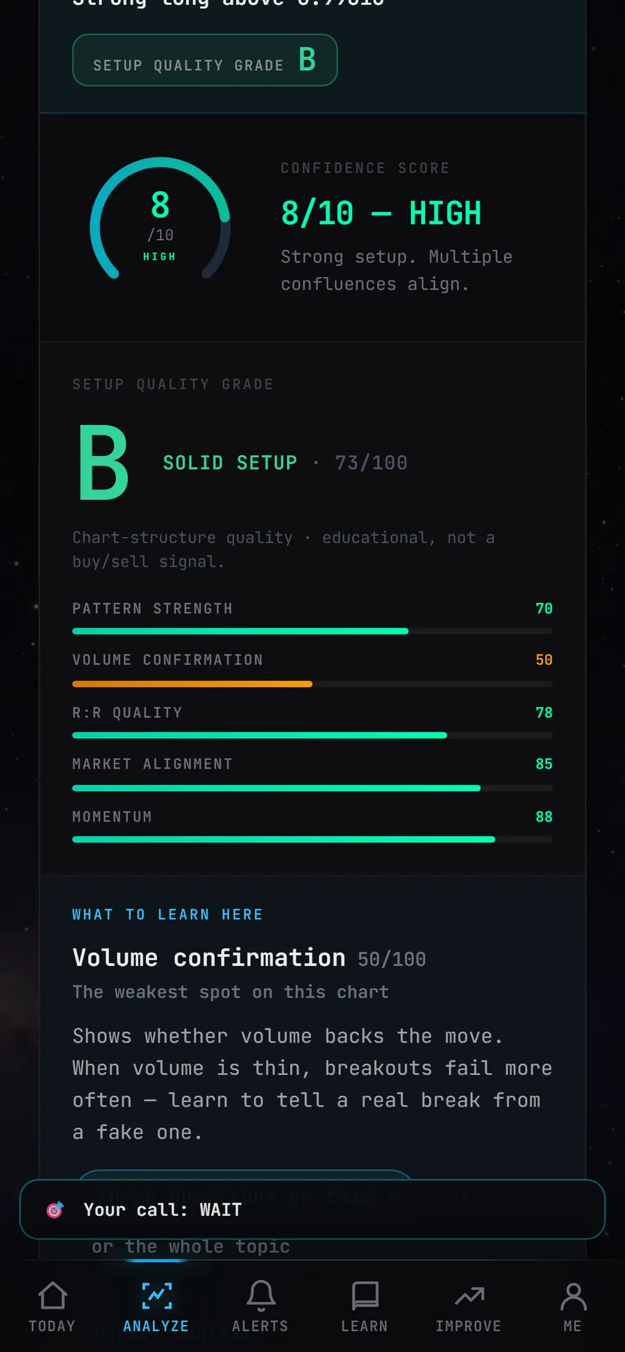
Notice two things. First, the verdict breaks the chart down into questions similar to the ones covered above: pattern strength, volume confirmation, R:R quality, market alignment and momentum. Second, the weakest spot is shown separately. In this example it is volume confirmation, only 50 out of 100: the move came with less trading than is usually expected for a reliable breakout.
Below the verdict the app also gives a plan: entry, stop loss, targets and an invalidation rule, meaning a condition under which the setup is considered no longer valid. This is the same seventh step of the routine: knowing in advance where the idea stops being valid.
The most common beginner mistakes
- Only minute charts. On 1-5 minute charts random noise looks like an important sign. 1D and 4H are better for a start.
- Too many lines. If you have drawn 15 levels on a chart, price will always be near one of them. Two or three key zones are enough.
- An indicator cocktail. RSI, MACD, the stochastic oscillator and two more moving averages often show the same thing, just at different times.
- Deciding before the candle closes. A candle that has not closed yet can change completely before its period ends. A breakout usually means a closed candle beyond the level, not a wick.
- A stop set after entry, or moved further away. It is worth knowing where the idea stops being valid before the trade, not after it. Moving the stop further from price only increases the possible loss.
- Ignoring BTC. When you analyse other coins (altcoins), it is worth keeping the BTC chart in view too: a strong BTC move often drags other coins along with it.
- Leverage too early. With 10x leverage, a price move of roughly 10% against the position would mean losing the entire margin, and liquidation happens even earlier. We explain how this works in Leverage and futures.
What to read next
- Candlestick patterns: the most common candle patterns and how to check them.
- Chart patterns: triangles, flags, head and shoulders.
- Support and resistance levels: how to draw zones and spot a false breakout.
- Risk management and stop loss: position size and stop placement.
- Leverage and futures: how liquidation works.
- How to start trading crypto: a plan for your first steps.
Frequently asked questions
Does technical analysis work for crypto?
Which timeframe should a beginner start with?
Which indicators should a beginner use?
How is technical analysis different from fundamental analysis?
Can the app's scanner replace my own analysis?
You can practise this routine every day: in the Skenuok app you first read the chart yourself, then compare your reading with the scanner's verdict.