Support and Resistance Levels: How to Find and Draw Zones on a Crypto Chart
Support and resistance levels show where price stalled before and where it may react again. In this article you will learn how to find them, why to draw zones rather than lines, how to spot a false breakout and where a stop goes relative to a level. The price examples come from real BTC and ETH charts and are given with dates.
What support and resistance are
Support is a price zone where declines have stalled more than once before, because buyers stepped in there. Resistance is a zone where rallies used to stall, because sellers showed up there. The simplest picture: support is the floor under price, resistance is the ceiling above it.
There are dynamic levels too: a rising trendline or a moving average can also act as support, but their position on the chart shifts with every new candle. This article covers horizontal zones, because they are the easiest to find and check.
Why does price react at the same places again? People say the market has a memory. Those who bought at a certain price and watched it fall often want to get out without a loss when price comes back. Those who missed the earlier bounce wait for a second chance. Obvious levels attract a lot of orders: limit orders, stops and take profit orders. The more participants watch the same level, the more likely price is to at least slow down there.
One thing is important to understand right away: a level is not a guarantee. It is a place to pay close attention, because price there often either bounces or breaks through and keeps going. Nobody knows in advance which will happen. If reading charts is still new to you, start with the article on technical analysis for crypto.
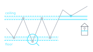
How to find a support level: 6 steps
Resistance is found the same way, except you look at highs instead of lows. The whole process takes a few minutes.
- Start with a higher timeframe. Open the weekly or daily chart and look back over at least 6-12 months of history. This shows you the levels that most market participants are watching.
- Mark the clear highs and lows. Look for places where price turned and then moved away by at least a few percent. Small swings without a clear reaction do not count.
- Look for repetition. One reaction is just a point. Once price has reacted at the same place 2-3 times, you have a level.
- Draw a zone, not a line. Put one edge at the candle bodies and the other at the wicks. Price rarely stops at exactly one number.
- Keep only the nearest zones. Usually 2-3 zones above the current price and the same number below it are enough. Distant levels change little about the decision in front of you.
- Refine on a lower timeframe. Switch to the 4H or 1H chart and fine tune the zone edges. Do not draw new levels for every small reaction.
Why draw zones, not lines
Different traders draw the same level differently: some through the wick tips, some through the candle bodies, others through a nearby round number. As a result, orders are spread across a band several percent wide instead of sitting at a single price.
BTC in 2024 is a good example. On 14 March price rose to 73,777 USDT, and on 29 October to 73,620. Between these two highs there were eight more weeks when the rally stalled between 70,080 and 72,798. In total, from March to October the highs of ten weeks landed between 70,000 and 74,000, and not a single week closed above 74,000. A line drawn exactly through 73,777 would almost never be touched, while the 70,000-74,000 zone covers all of these reactions.
Zone width depends on the timeframe and on how volatile the coin is. In this BTC example the weekly zone is about 5.7% wide, while zones on the hourly chart are usually much narrower. Some traders tie the zone width to ATR, the average candle range.
One more practical point. A wick shows where price went but could not hold, while the close shows where price ended the period. That is why a breakout is usually judged by the candle close rather than by the wick. How to read wicks and bodies is explained in the article on candlestick patterns.
How to tell if a level is strong
Not all levels are equal. Before relying on a zone, it is worth checking it against a few signs. This is not a scoring system with a guarantee, just a way to separate important zones from random ones.
| Sign | Stronger level | Weaker level |
|---|---|---|
| Timeframe | Visible on the weekly or daily chart | Visible only on the 5 or 15 minute chart |
| Number of reactions | 2-4 clear reactions | One reaction |
| Size of the reaction | On the daily or weekly chart, price moved 5-10% or more away from the level | Price barely moved and came back |
| Freshness | Reactions in recent months | Last reaction several years ago |
| Trading volume | Volume near the level is higher than usual | Volume is low |
| Confluence | Lines up with a round number or an earlier low | Stands alone, with no other reason |
The number of touches deserves a separate note. It is often said that the more touches, the stronger the level. That is partly true, but every touch “eats” some of the orders that were waiting there. When price keeps coming back to the same zone and bounces weaker each time, it more often means the zone is weakening, not getting stronger. Repeated tests of the same zone are also the basis of double tops, triangles and other chart patterns.
Role reversal: resistance becomes support
A broken level often switches roles. Former resistance becomes support, and former support becomes resistance. The logic is simple: those who sold at the ceiling and watched price rise often want to buy back when price returns, and those who missed the breakout wait for price to come back to the level.
The ETH chart below shows this very clearly. From March 2024 to July 2025 the ETH weekly high reached the 3,940-4,110 USDT zone eight times, but not a single week closed above it. The highs were 4,094 on 12 March 2024, 4,108 on 16 December and 3,941 on 28 July 2025. On 9 August 2025 the daily candle closed at 4,261, above the zone. It was the first daily close above it in that entire period. On 19-20 August price came back into the zone from above and dipped to 4,060, but on 20 August it closed at 4,336. On 24 August ETH rose to 4,957.

The same chart teaches another lesson: no level works forever. In September and October 2025 weekly wicks dipped below the zone several times, as low as 3,435, but the weeks closed inside the zone or above it. The week starting 27 October closed at 3,907, already slightly below the zone, and the week starting 3 November closed at 3,583. Support failed, and the zone had to be reassessed: by February 2026 ETH had fallen to 1,748.
Round numbers: psychological levels
People think in round numbers. Buy and sell orders and stops are often placed at 60,000, 70,000, 100,000 or 4,000, so more liquidity builds up there and price often slows down. Both zones in this article are also tied to round numbers: the ETH zone includes 4,000, and the BTC zone starts at 70,000.
For ETH in December 2024 you could see this in the numbers themselves: the daily candles on 6, 7 and 8 December closed at 3,999, 3,996 and 4,004. For three days price held near 4,000, and on 9 December it dropped to 3,509. On 6 February 2026 the BTC daily low was exactly 60,000.00 USDT, and the day closed at 70,580.
But a round number is not a wall. On 5 June 2026 BTC fell to 59,131, below 60,000. Also, many stops often sit just beyond a round number, so price sometimes briefly pushes past it and only then turns around. This move is called a stop hunt. A round number is most useful when it lines up with another reason: an earlier low, a higher timeframe zone or a Fibonacci retracement level.
Why higher timeframe levels matter more
More participants watch a weekly level, while a level on the 15 minute chart can lose its meaning within a few hours. So when levels on different timeframes contradict each other, the higher timeframe usually takes priority.
In practice it looks like this: on the weekly chart you find the main zones, on the daily chart you see how price is behaving near them right now, and on the 4H or 1H chart you fine tune where the entry and the stop would be. This approach is called multi-timeframe analysis.
BTC illustrates this well. The 70,000-74,000 zone formed on the 2024 weekly chart. On 6 November 2024 BTC closed above it for the first time (75,572), dipped to 74,416 the next day and kept rising. On 7 April 2025 price fell to 74,508 and bounced just above the zone. On 5 February 2026 the zone broke to the downside (close 62,910), and afterwards it capped rallies from below for about two months. Over two years the same price band acted as resistance, then support, then resistance again.
False breakouts: how to tell them apart
A false breakout (fakeout) is when price briefly moves beyond a zone but quickly comes back. Beyond an obvious level there are often many stops and orders that trigger once price crosses it. Take the area above resistance: once these buy orders are filled, there may not be enough new buyers left, and price drops back. Those who bought just as price crossed the level are left with a loss.

The chart shows two attempts to close above the zone. On 16 March BTC closed at 74,885, above 74,000. The next day the wick reached 76,000, but the candle closed at 73,909, back inside the zone. By 22 March the close was 67,859. April looks different: six daily candles in a row closed above the zone, and on 19-20 April price came back into the upper part of the zone (low 73,724) but did not drop any deeper.
| Sign | March 2026 | April 2026 |
|---|---|---|
| Consecutive daily closes above 74,000 | 1 (16 March: 74,885) | 6 (13-18 April) |
| Day after the first close above the zone | Wick to 76,000, close 73,909 inside the zone | Close 74,132, above the zone |
| What happened next | Close of 69,930 on 19 March, below the zone | Low of 73,724 on 20 April, close 75,841 |
| Lowest close over the next 7 days | 67,859, or 9.4% below the 16 March close | 73,802, or 0.8% below the 13 April close |
There is no way to tell a real breakout from a false one with certainty in advance. Still, traders usually check a few things:
- The close, not the wick. A wick above the level means little on its own. What matters is where the candle closes.
- The close on a higher timeframe. A 5 minute candle closing above the level is a weaker sign than a daily close.
- What happens next. If the next candle returns into the zone, the breakout is in doubt.
- The retest. Some traders wait for price to come back to the broken level and see it hold from the other side. That way they miss part of the move, but get trapped less often.
- Volume. A breakout on higher trading volume is usually seen as more reliable. In this BTC example, however, volume on 16 March (about 28,400 BTC) was higher than on 13 April (about 24,200 BTC), so volume alone cannot be relied on.
And a real breakout does not last forever either: on 2 June 2026 BTC closed below the zone again, at 66,761. These signs help avoid some mistakes, but not all of them.
How levels relate to stop loss placement
Traders most often use levels in two ways: they wait for a bounce off a zone, or for a breakout through it followed by a retest. Either way, the level shows not only where price may react but also where your idea is no longer valid.
If the trade logic rests on support, the stop loss order is placed where support is clearly broken: beyond the edge of the zone, with a small buffer. Not inside the zone and not exactly at a round number, because ordinary volatility or a brief wick would reach it there. From here on we will simply call it the stop.
A worked example
Suppose a coin's support zone is 96-98 USDT: three lows formed at 96.4 USDT, 97.1 USDT and 97.8 USDT. An entry is being considered at 100 USDT, and the nearest resistance is at 110 USDT.
- Stop. It is placed not at 98 but below the whole zone with a buffer, for example at 95.2. The distance from entry to stop is 4.8 USDT, or 4.8%.
- Risk. The account is 2,000 EUR. A common risk management rule is to risk no more than 1-2% of the account on a single trade. At 1%, the maximum acceptable loss is 20 EUR.
- Position size. The risk is divided by the distance to the stop: 20 / 0.048 ≈ 417 EUR. If the stop is hit, the loss is about 20 EUR, not counting fees and slippage.
- Ratio to the target. There are 10 USDT to the resistance at 110, so the risk to reward ratio is about 1:2.1 (10 / 4.8). If the take profit target is set slightly below resistance, the ratio comes out somewhat lower.
In a short position, which gains when price falls, everything is mirrored: the stop goes above the resistance zone. If a wide zone puts the stop too far away, traders usually choose a smaller position or skip the trade rather than move the stop inside the zone. We cover this in more detail in the article on risk management and stop loss.
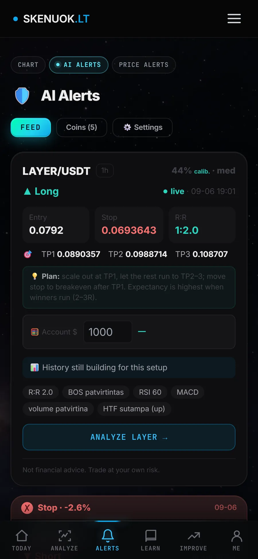
In the Skenuok app, AI Alerts show the entry, stop, targets and risk to reward ratio, and a position size calculator works out the amount for your account.
When trading with leverage, one more limit matters: the liquidation price must be well beyond the stop. How it is calculated is explained in the article on leverage and futures.
Common mistakes when using levels
- Too many lines. With 15 levels on the chart, price will always be “near some level”.
- A line through a single wick tip. One extreme point is not a level yet.
- Levels from the 5 minute chart only. Without daily and weekly zones you cannot see where the biggest obstacles are.
- Deciding on a wick. Not waiting for the close is exactly how people most often get caught in a false breakout.
- A stop inside the zone or right at a round number. Ordinary volatility often reaches it there.
- Clinging to outdated levels. When price has clearly broken a zone and settled on the other side, the levels need to be redrawn.
Frequently asked questions
How do you find a support level on a chart?
What is the difference between support and resistance?
How many times does price need to touch a level for it to matter?
Which timeframe is best for support and resistance levels?
Do support and resistance levels work in crypto?
In the Skenuok app you can upload a chart screenshot and compare the zones you drew with the levels and structure from the AI chart scanner.