Chart patterns in crypto technical analysis: how to spot them and when they are invalidated
Chart patterns are recurring price shapes that traders use to judge whether a trend is likely to continue or to turn. Here you will find the main technical analysis patterns, the rules for confirming and invalidating them, and three real Binance examples. One of them failed, and that is the one that teaches the most.
What is a chart pattern
A chart pattern is a price shape that forms over dozens of candles: a few highs and lows that can be joined with lines. It shows how the balance of power between buyers and sellers has shifted. When price stops at the same level several times, many traders notice that level: orders often build up there, so a part of the market makes decisions based on the same line.
Chart patterns are not the same as candlestick patterns, which are usually made of one, two or three candles. We cover those in the candlestick patterns article, and you will find the wider foundation in the crypto technical analysis guide.
Patterns are usually split into two groups. Reversal patterns suggest that the previous direction may be ending. Continuation patterns suggest a pause after which the same direction may resume. In both cases the key word is “may”: a pattern describes a scenario with conditions, not the future.
The three parts every pattern needs
Before you call a shape a pattern, check that you can name three things. If even one of them is missing, for now it is just a drawing.
- Context. A reversal pattern needs a clear prior direction to reverse. A head and shoulders after a long decline has nothing to turn over.
- Confirmation level. This is the line price has to cross: the neckline, the edge of a triangle, the boundary of a flag. A pattern counts as confirmed when a candle closes beyond this line. A wick that briefly pokes through the line and comes back does not count as confirmation.
- Invalidation level. This is the price beyond which a candle close means the scenario no longer holds. It is worth setting before the decision, not after it. This is exactly where traders often place a stop loss order, or a stop for short.
Reversal patterns: head and shoulders, double top and double bottom
Head and shoulders
This is the classic reversal pattern at the end of an uptrend. It is made of three peaks: the middle one (the head) is the highest, and the two on either side (the shoulders) are lower and of similar height. The lows between them are joined by the neckline. As long as price holds above it, the pattern is not confirmed.
The mirror version is the inverse head and shoulders at the end of a downtrend: three lows, the middle one the deepest, and confirmation is a close above the neckline.

On the DOGE/USDT daily chart the left shoulder formed on 11 January 2025 (0.3482), the head on 18 January (0.4341) and the right shoulder on 31 January (0.3418), while the neckline ran through the lows at 0.3097 and 0.3051. On 1 February a wick dipped to 0.3033, but the candle closed at 0.3079, above the line, so there was no confirmation yet.
Confirmation came on 2 February: a close at 0.2681, with daily trading volume of about 1.04 billion USDT, roughly one and a half times the average of the previous 20 days. Up to 15 March price never closed above the neckline again: the highest close after the breakdown was 0.2849.
This is not a textbook example: the shoulders sit well below the head, and on 4 January price had risen to 0.3988, above both shoulders, so this area could also be drawn differently. What decided it was not the shape but the close below the neckline.
Double top and double bottom
A double top looks like the letter M: price rises to a similar level twice and is turned back down both times. The confirmation level is the low between the peaks. A double bottom is the mirror image, the letter W, and confirmation is a close above the high between the two lows. Triple tops and triple bottoms follow the same logic, just with three attempts.
This pattern is easy to see where there is none, because any sideways market has several similar peaks.

On the ETH/USDT 4-hour chart the tops formed on 3 September 2025 (4,490.64) and 5 September (4,490.00), with the low between them on 4 September (4,265.33). On 6 September the 16:00 UTC candle closed at 4,255.48. Formally that is confirmation, but the close was only 0.23% below the line, on a Saturday, and the candle's trading volume (about 253 million USDT) was below the average of the previous 30 candles (348 million).
The very next candle closed back above the neckline, and the 12 September close at 4,505.55, above both tops, invalidated the pattern. The context was visible in advance: on 31 August price had already reached 4,498.47, and on 1 September it had dropped to 4,210.61, below the supposed neckline. This was not an M at the top of a trend but a sideways range between roughly 4,210 and 4,500.
Continuation patterns: triangles, flags and pennants
Triangles
In a triangle the price swings keep narrowing until the two lines almost meet. There are three types:
- Ascending triangle: flat resistance on top and rising lows. Buyers step in at a higher price each time, so it is usually read as a bullish scenario.
- Descending triangle: flat support at the bottom and falling highs. The logic is mirrored: here the sellers apply the pressure.
- Symmetrical triangle: the highs get lower and the lows get higher. The direction is not clear in advance, so traders usually wait to see which way the breakout goes.
Confirmation is always the same: a close beyond the edge of the triangle. In an ascending triangle price can break the lower line too. If price gets very close to the point where the lines meet and there is still no breakout, many traders consider the pattern exhausted.
Flags and pennants
A flag forms after a sharp move called the pole: price briefly swings in a narrow channel, often drifting slightly against the previous direction. In a pennant the pause takes the shape of a small symmetrical triangle. The pause should be short and shallow compared with the pole.

On the BTC/USDT 4-hour chart price climbed from 109,189.99 (28 September 2025) to 114,792 in 36 hours. That is the pole: 5,602 USDT, or about 5.1%. The flag lasted 32 hours: price moved almost sideways between 112,656 and 114,792, and the pullback came to about 38% of the pole's length. On 1 October the 08:00 UTC candle closed at 116,789.58, above the flag, and its trading volume (about 605 million USDT) was roughly 2.2 times the average of the flag candles (272 million).
We chose this example because it is clear. Not every flag ends this way: some of them turn into a false breakout.
Wedges and ranges
Rising and falling wedges
In a wedge both lines slope in the same direction and converge, while in a triangle at least one line is flat or the lines slope in opposite directions. A rising wedge shows a rising price, but each new high comes with more effort, so it is often read as a weakening rally. A falling wedge is the mirror image: the decline slows down, and traders watch for a breakout to the upside.
Wedges do not always end the way textbooks describe: the breakout can go the other way, so here too it is the close beyond the line that decides, not the shape.
Ranges and rectangles
In a sideways market, or range, price swings between two horizontal levels: support below and resistance above. When such a channel is clear and lasts longer, it is called a rectangle. In the middle the direction is unclear, so what matters most are the edges and a close beyond them. We explain how to draw these levels in the article Support and resistance levels.
Chart patterns in one table
The table shows how each pattern is usually read, what counts as confirmation and when the scenario no longer holds. It is a starting point, not a rule.
| Pattern | Usual reading | Confirmation | Invalidated when |
|---|---|---|---|
| Head and shoulders | End of an uptrend | Close below the neckline | Close above the right shoulder |
| Inverse head and shoulders | End of a downtrend | Close above the neckline | Close below the right shoulder |
| Double top (M) | End of an uptrend | Close below the low between the tops | Close above the tops |
| Double bottom (W) | End of a downtrend | Close above the high between the lows | Close below the lows |
| Ascending triangle | Bullish scenario | Close above the flat top | Close below the rising lower line |
| Descending triangle | Bearish scenario | Close below the flat bottom | Close above the falling upper line |
| Symmetrical triangle | Direction unclear | Close beyond either edge | Return inside the triangle after the breakout |
| Flag, pennant | Continuation of the prior direction | Close beyond the flag boundary in the direction of the pole | Close beyond the opposite flag boundary |
| Rising wedge | Weakening rally | Close below the lower line | Close above the upper line |
| Falling wedge | Weakening decline | Close above the upper line | Close below the lower line |
| Range, rectangle | Balance | Close beyond the edge of the range | Return into the range after the breakout |
Confirmation and invalidation: when a pattern holds and when it does not
Confirmation is not a single sign. Traders usually look at several things together:
- A close, not a wick. What counts is the candle close on the same timeframe: 4-hour candles on the 4-hour chart, daily candles on the daily chart.
- Distance beyond the line. A close just 10 USDT below the line, as in the ETH example, is weak. Some traders wait for a clearer distance or for two closes in a row.
- Trading volume. A breakout on higher than usual volume shows that many participants are behind the move. In the BTC example volume on the breakout candle was 2.2 times the average, while in the ETH example it was below average.
- Retest. After a breakout price sometimes comes back to the broken level and tests it from the other side. If the level holds, the scenario gets stronger, but a retest does not always happen: DOGE never came back to its neckline.
- Higher timeframe. A pattern that agrees with the direction of the higher timeframe is usually considered more reliable than one that goes against it.
The invalidation level has to be clear before the decision. For a head and shoulders it is often the top of the right shoulder, for a double top the level of the tops, for a bull flag its lower boundary. If a candle closes beyond this level, the scenario no longer holds, and there is no point in rescuing it by moving the line. We explain how to work out position size from the distance to this level in the risk management article.
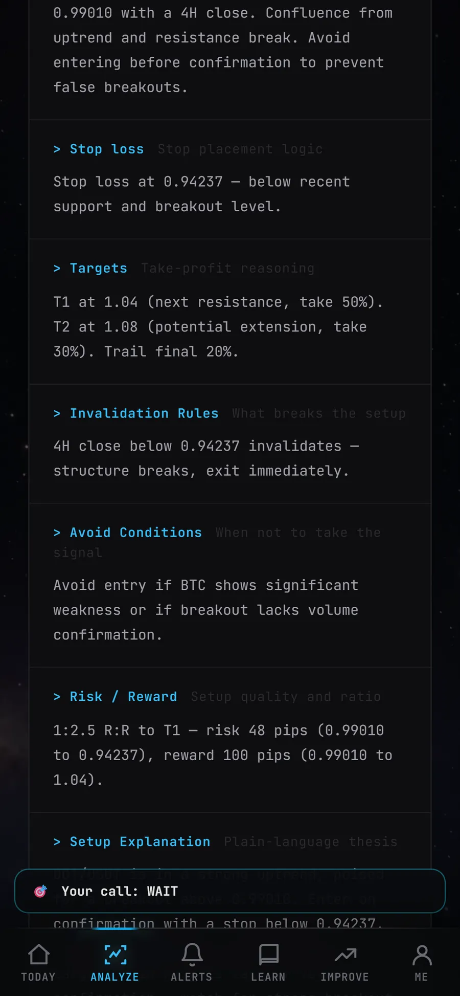
The Skenuok app's AI chart scanner plan lists the entry, the stop, targets T1-T3 and the invalidation rule.
Measured move: how the target is calculated and why it should not be trusted blindly
The measured move is a simple way to estimate how far price could travel after a breakout: the height of the pattern is projected from the breakout point. For a head and shoulders it is the distance from the head to the neckline, for a double top the distance from the tops to the low between them, for a flag the length of the pole.
| Example | Height | Target | What happened |
|---|---|---|---|
| DOGE/USDT 1D, head and shoulders | 0.1290 (from the head at 0.4341 to the neckline at 0.3051) | 0.1761 | Reached on 2025-03-09, after 35 days |
| ETH/USDT 4H, double top | 225.31 (from 4,490.64 to 4,265.33) | 4,040.02 | Not reached: the pattern was invalidated on 12 September, and on 13 September price rose to 4,769.36 |
| BTC/USDT 4H, bull flag | 5,602 (length of the pole) | 120,394 | Reached the next day, 2025-10-02 |
Two targets reached, one not. This is not a statistic, just three examples picked for teaching, but they show three things well:
- A target says nothing about time. DOGE took five weeks to get there, while BTC reached it the very next day.
- The road to the target can be very rough. On 3 February DOGE fell as low as 0.2018 during the day but closed at 0.2849, that is 41% above the day's low.
- A pattern can be invalidated before the target is reached. That is what happened with ETH, which is why knowing the invalidation level matters more than knowing the target.
Before relying on a target, traders compare the distance to it with the distance to the invalidation level. If the target is 3% away and the invalidation level is 6% away, the risk to reward ratio (R:R) is poor even with the prettiest pattern. Some traders take profit earlier, at the nearest level, because a measured target is a guide, not a promise.
The most common mistakes when spotting patterns
- Looking for patterns when you already know the ending. Drawing lines in hindsight is easy. The real question is: would you have spotted the pattern at the right-hand edge of the chart, before it was complete?
- Deciding before confirmation. Until the neckline is broken, a head and shoulders is only a possible pattern.
- Ignoring context. A double top in the middle of a range is something completely different from a double top after a long rally.
- Too small a timeframe. A 1 or 5 minute chart is full of shapes, but even fuller of noise. Beginners find it easier to learn on 4-hour and daily charts.
- Moving the invalidation level. If price has closed beyond the invalidation level, the scenario no longer holds. Drawing a new line does not save it.
- Using leverage because a pattern looks “clear”. Even a clear pattern can fail, and with leverage a small move against you can end in liquidation. More on this in the leverage and futures article.
How to train your eye for patterns without risk
Patterns are best learned on historical charts. Hide the right-hand part of the chart, mark the pattern and its confirmation and invalidation levels, write down what you expect, and only then reveal what came next. Log the patterns that failed in your journal too: they teach the most.
The Skenuok app has a library of 54 patterns with real Binance charts. You can upload an image of your own chart to the AI chart scanner and get the structure, the levels, a scored setup assessment and an invalidation rule, and in the daily scan you guess the direction before you see the verdict. If you are just starting out, first read how to start trading crypto.
Frequently asked questions
What are the main chart patterns?
Do chart patterns work in crypto?
How is a chart pattern different from a candlestick pattern?
How do you calculate a chart pattern target?
You can learn to spot chart patterns in the Skenuok app: it has a library of 54 patterns with real Binance charts, and the AI chart scanner plan also includes an invalidation rule.