How the crypto market works: exchanges, coins, orders and wallets.
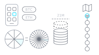
Exchange (CEX and DEX)
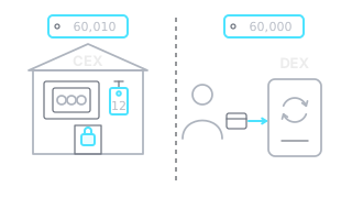
A place where you buy and sell crypto. A centralized exchange (CEX) is run by a company, while on a decentralized one (DEX) you trade straight from your own wallet.
Example: An exchange chart shows only that exchange's trades, so the BTC price can differ slightly between exchanges.
Coin, token and market cap
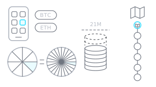
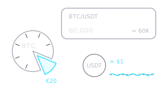
A coin has its own network (BTC, ETH), while a token runs on another network. Market cap is the price multiplied by the number of units in circulation.
Example: The chart price does not show a project's size: if one coin costs 0.01 USD and there are 100 billion in circulation, together they are worth 1 billion USD.
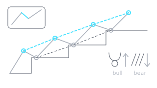
The overall direction of price: up when highs and lows keep rising, down when they keep falling. If price swings between two levels, the trend is sideways.
Example: If on the daily chart every dip stops above the previous one, the trend is up.
Bull and bear market
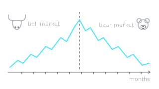
A bull market is a long stretch, months at least, when prices mostly rise and people are optimistic. A bear market is the opposite: prices fall for months and fear rules.
Example: On the weekly chart BTC fell 60 % from its peak and could not recover for months: that is a bear market.
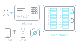
A wallet holds the keys that control your crypto: a hot one is online, a cold one is not. The seed phrase is 12 or 24 words: whoever knows it controls your coins, so never show it to anyone or photograph it.
Example: You can follow the price of coins in a cold wallet on the chart, but to sell them on an exchange you first have to transfer them back.
Circulating supply shows how many coins can be traded right now. Max supply shows how many can ever exist, e.g. 21 million for BTC.
Example: If only 20 % of all coins are in circulation, the rest may be released later and push the price down.
FOMO, FUD and HODL
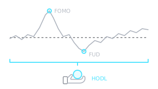
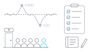
FOMO is the fear of missing out that pushes you to buy without a plan, and FUD is news that spreads fear. HODL means holding for the long run despite the swings.
Example: Price rallies hard three days in a row and everyone talks about the rise: that is the FOMO moment when it is easiest to buy the top.
DCA, dip and ATH
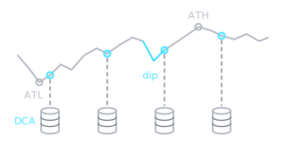
DCA means buying the same amount at regular intervals regardless of price, and a dip is a short price drop. ATH and ATL are the highest and lowest price ever.
Example: When price breaks its ATH, there are no earlier levels above it on the chart, so it is harder to judge where it may stop.
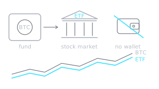
A fund whose shares trade on a stock exchange. A BTC ETF rises and falls with the BTC price, so you can invest without holding the coins or a wallet.
Example: Big inflows into BTC ETFs are often mentioned in the news when explaining why price rose that day.
Blockchain
A public ledger of transfers made of blocks, each linked to the previous one. Its records cannot be quietly changed.
Example: An exchange chart shows trading on that exchange, not on the blockchain: transfers between wallets do not appear on it.
US central bank (Fed)
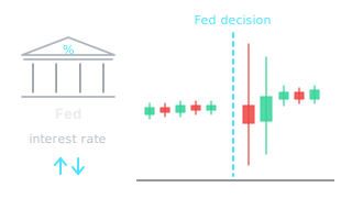
The US central bank, which sets interest rates. They decide how much it costs to borrow, so Fed decisions affect risky assets, crypto included.
Example: On the evening of a Fed decision the chart often shows sharp spikes both ways within minutes.
Perpetual futures
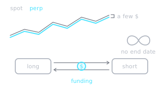
A futures contract with no end date, used to open longs or shorts with leverage. Its price is kept near spot by the funding fee that longs and shorts regularly pay each other.
Example: On the same exchange the BTC/USDT spot and perpetual charts almost match but differ by a few dollars.
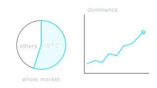
BTC's share of the total crypto market cap. Rising dominance shows money is flowing into BTC more than into other coins (altcoins).
Example: BTC's price rises and dominance rises too: BTC is gaining faster than the market as a whole, so altcoins are usually lagging.
Halving
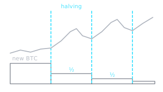
An event about every four years when the issuance of new BTC is cut in half. It limits the supply of new coins.
Example: On the weekly chart you can mark halving dates with vertical lines and compare how price behaved after each one.
Network fee (gas)
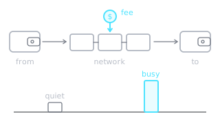
A fee for a transfer or other action on a blockchain. It is paid to the network, not the exchange, and rises when the network is busy.
Example: When withdrawing a small amount from an exchange, the network fee can eat part of what you made on the price move.
Market cycle
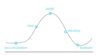
Recurring market phases: accumulation, rise, peak, decline and bottom. In crypto they are often linked to the halving, but the exact timing does not repeat.
Example: The weekly chart shows long rising and falling phases that last years, not months.
Candles and patterns
How to read a candle and what the most common patterns mean.
Candle
One element of a candlestick chart that shows how price moved over a chosen time, like an hour or a day. It has a body and wicks.
Example: On the daily chart each candle is one day: at a glance you see where price started, where it ended and how far it swung.
The four candle prices (OHLC)
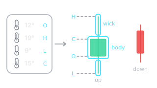
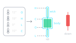
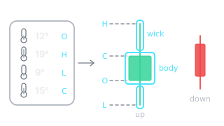
Every candle has four prices: open, high, low and close.
Example: Tap a candle on the chart to see its O, H, L and C values: they tell you whether the period ended up or down.
Candle body
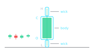
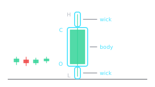
The thick part of the candle between the open and the close. The longer the body, the more decisively price moved in that period.
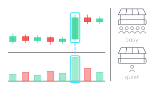
Example: A long green body after several small candles shows buyers suddenly took charge.
Wick
The thin line above or below the candle body. It shows how far price went but could not hold.
Example: A long lower wick at support means sellers pushed price down, but buyers brought it back by the close.
Bullish and bearish candle
A bullish candle closes higher than it opened and is usually green. A bearish candle closes lower and is usually red.
Example: Five red candles in a row mean that for five periods straight the close was below the open.
Timeframe
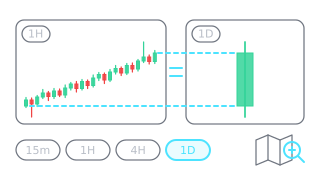
How much time one candle covers: 15m, 1h, 4h or 1D. A lower timeframe shows lots of small random swings, a higher one shows the bigger picture.
Example: What looks like a sharp drop on the 15-minute chart may be just a small wick on the daily chart.
Buyers and sellers
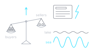
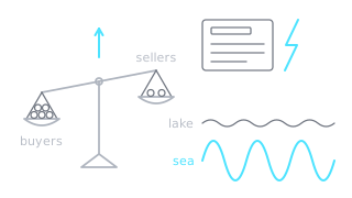
Price rises when buyers are willing to pay more and falls when sellers accept less. Each candle shows which side was stronger that period.
Example: A green candle with small wicks means buyers were in control for the whole period.
Pattern and signal
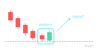
A pattern is a recognizable shape of one or more candles. A signal is a hint about where price may go, but what it means depends on where it appears on the chart.
Example: A candle with a long lower wick after a long drop can hint that price will turn up, while the same candle after a long rally can warn of a drop.
Reversal and continuation
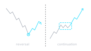
Reversal: the trend ends and price turns the other way. Continuation: after a short pause price keeps moving the same way.
Example: After a long rally price stalls for a few days: if it rises again that is continuation, if it starts falling that is a reversal.
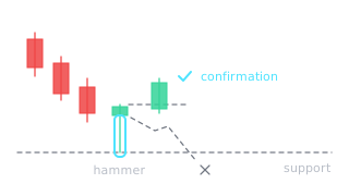
Confirmation
An extra sign that a signal is working, e.g. the next candle closes in the expected direction. Without it a signal may be only a brief reaction.
Example: At support a candle with a long lower wick appears, and the next candle closes above its high: that confirms buyers kept control.
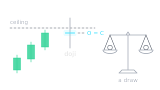
Doji and indecision
A candle whose open and close are almost the same, so the body is very thin. It shows buyers and sellers were evenly matched.
Example: A doji at resistance after a long rally shows buyers are losing strength. The next candle shows the direction.
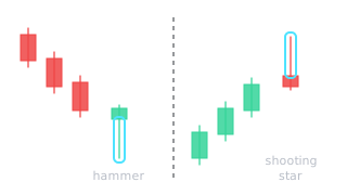
Hammer and shooting star
Candles with a small body and one long wick. A hammer (long lower wick) after a drop shows buyers pushing back; a shooting star (long upper wick) after a rally shows selling pressure.
Example: After five red candles a hammer appears at support: the drop may stop, but only if the next candle confirms it.
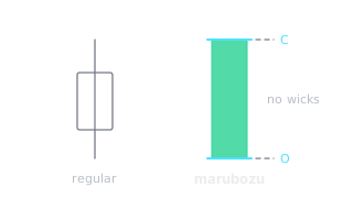
Marubozu
A candle with almost no wicks: price opened at one end and closed at the other. It shows one side dominated the whole period.
Example: A big green marubozu breaking through resistance shows buyers gave sellers no chance at all.
Engulfing
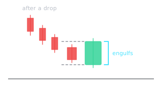
A two-candle pattern: the second candle's body fully covers the first one's body and has the opposite color. It shows control has passed to the other side.
Example: After a drop, a small red candle followed right away by a big green one that covers it completely: that is a bullish engulfing.
Morning and evening star
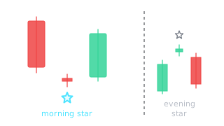
A three-candle pattern: a big candle, a small indecisive one, then a big one the other way. A morning star hints at a rise after a drop, an evening star at a fall after a rally.
Example: A big red candle, then a doji, then a green one closing above the middle of the first: a morning star has formed on the chart.
Window
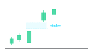
The Japanese name for a gap: empty space between two candles. A rising window shows strong buyers, a falling one strong sellers.
Example: The second candle's low is above the first candle's high: a rising window has formed between them.
Three white soldiers
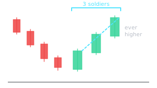
Three long green candles in a row with small wicks, each closing higher than the last. After a drop it shows buyers returning in force.
Example: After a week of decline, three big green daily candles in a row close higher and higher: three white soldiers.
Harami
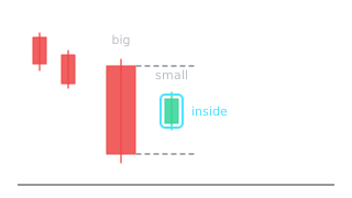
A two-candle pattern: the second candle's small body fits inside the first candle's large body. It shows the move has slowed down.
Example: After a big red candle comes a small green one whose body fits inside the red one: a bullish harami.
Tweezer top and bottom
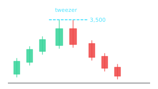
Two candles in a row with almost the same high (top) or low (bottom). Price is rejected twice at the same level.
Example: Two daily candles in a row reach the same 3,500 high and drop back: a tweezer top on the chart.
Piercing line
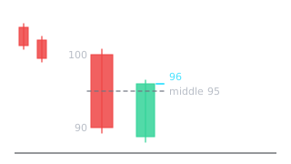
A two-candle pattern after a drop: after a big red candle, a green one closes above the middle of the red body.
Example: A red candle from 100 to 90, then a green one closes at 96: more than half the red body, so a piercing line.
Heikin Ashi candles
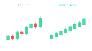
A candle type calculated from averages, so the chart looks smoother and the trend is easier to see. It does not show the real open and close.
Example: On a Heikin Ashi chart an uptrend looks like a long run of green candles with no lower wicks.
Multi-timeframe analysis
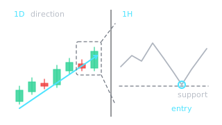
You look at the same coin on several timeframes: the higher one sets the direction, the lower one helps you find a more precise entry.
Example: The daily trend is up, so on the 1-hour chart you look for a pullback to support rather than a short.
Spinning top
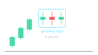
A candle with a small body in the middle and similar wicks on both sides. It shows indecision like a doji, only with a slightly bigger body.
Example: After a strong rally, several spinning tops in a row show buyers are taking a pause.
Support and resistance
Where price tends to stop, bounce or break through.
Support
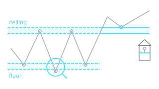
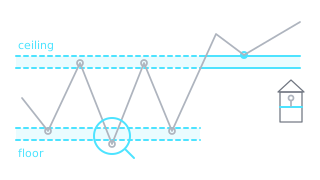
A price level where drops have stopped several times before because buyers showed up there. On the chart it is a line under the lows.
Example: BTC fell to 58,000 three times and bounced each time: 58,000 is support.
Resistance
A price level where rallies used to stall because sellers showed up there. On the chart it is a line above the highs.
Example: ETH reached 4,000 twice and pulled back both times, leaving a long upper wick: 4,000 is resistance.
Level and zone
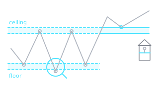
A level is a price where the market has already reacted several times. In practice it is more often a zone, a narrow band, because price rarely stops at one exact number.
Example: Lows at 57,800, 58,050 and 58,200 point not to one line but to a support zone of 57,800-58,200.
Bounce and touches of a level
A bounce: price touches a level and turns back. The more touches a level has held, the more the market watches it, though in time it may still give way.
Example: Price drops to support, leaves a lower wick and the next candle closes higher: that is a bounce.
Swing high and swing low
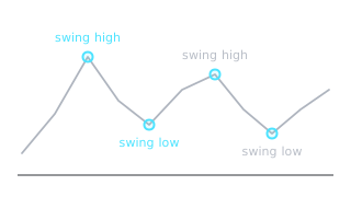
A swing high is a local top and a swing low is a local bottom. Levels are drawn and trends are read from these points.
Example: Price rose to 3,200, dropped to 3,000 and rose again: 3,200 became a swing high and 3,000 a swing low.
Higher and lower highs and lows
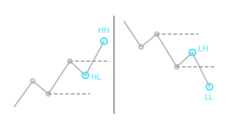
In an uptrend each high and low is above the previous one: HH (higher high) and HL (higher low). In a downtrend both are lower: LH (lower high) and LL (lower low).
Example: Lows at 100, 110, 120 and highs at 130, 140, 150: the chart shows a clear rising structure of HH and HL.
Range and channel
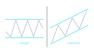
A range (consolidation): price swings between two levels with no clear direction. A channel: two parallel lines that price moves between, up, down or sideways.
Example: For two weeks price bounces between 25 and 28: that is a range until one of the edges breaks.
Trendline
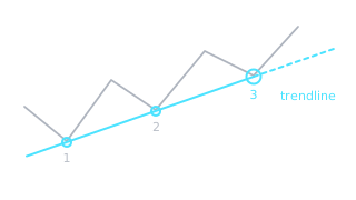
A sloped line joining at least two lows in an uptrend or at least two highs in a downtrend. As long as price respects it, the trend continues.
Example: Connect two rising lows: when price drops to the line a third time and bounces, the line is confirmed.
Breakout
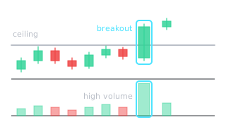
Price convincingly moves above resistance or below support and closes there. A stronger breakout comes with higher volume.
Example: A 4-hour candle closes above 30,000 resistance with twice the average volume: that is a breakout.
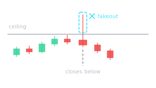
Price briefly moves past a level but quickly comes back. Those who bought as soon as it broke through are left at a loss.
Example: A wick shoots above resistance but the candle closes below it: a typical fakeout picture.
Retest
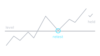
After a breakout price comes back to the broken level and tests it from the other side. If the level holds, the breakout is more reliable.
Example: Price broke 30,000, a day later dipped to 30,100 and rose again: that is a successful retest.
Resistance turns into support
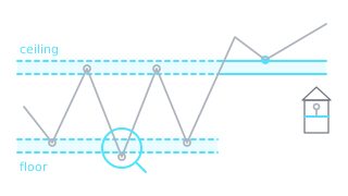
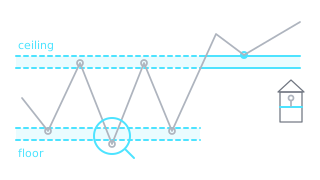
A broken level often switches roles: old resistance becomes support, and old support becomes resistance.
Example: For a month 50 stopped every rally; after the break price dips to 50 and bounces: former resistance now acts as support.
Psychological levels
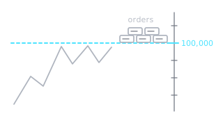
Round numbers such as 50,000 or 100,000. Many people place orders at them, so price often slows down or turns around there.
Example: BTC approached 100,000 several times and pulled back: the round number acted as resistance.
Confluence
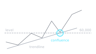
When several different signs point to the same place, e.g. support and a round number. Such a level is more reliable than a single sign.
Example: Support at 60,000 lines up with a round number and an earlier low: three reasons for buyers to show up in the same spot.
Previous highs and lows, pivot points
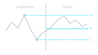
Yesterday's and last week's high and low often become levels. Pivot points are levels too, only calculated from the previous period's high, low and close.
Example: Today price stopped exactly at yesterday's high: many traders watch that level.
Fibonacci retracement
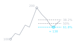
A tool that draws levels at 38.2 %, 50 % and 61.8 % of a move between a swing low and a swing high. They show where a pullback may stop.
Example: A rise from 100 to 200: the 50 % retracement is at 150 and the 61.8 % at about 138.
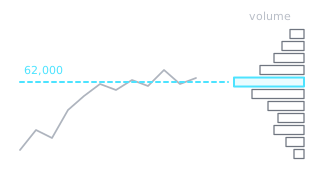
Horizontal bars at the side of the chart showing how much traded at each price. The prices with the most volume often become levels.
Example: The longest profile bar at 62,000 shows the most trading happened there: price often slows down near it.
Liquidity sweep
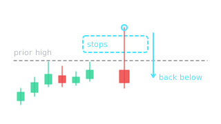
A fast move past an obvious level where many stops are waiting: they fire, and price quickly comes back. It leaves a long wick past the level on the chart.
Example: Price pokes above yesterday's high, leaves a long upper wick and closes back below it.
Accumulation
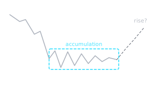
A long sideways period after a decline, when price moves in a narrow range while buyers slowly accumulate. A rise may follow.
Example: After a big decline, price sits between 16,000 and 20,000 for months while the swings keep shrinking.
Premium and discount zones
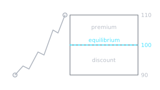
The price range between a swing low and a swing high is split in half: the upper half is called premium, the lower half discount, and the middle equilibrium.
Example: A range from 90 to 110: everything above 100 is premium, below 100 is discount.
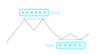
Liquidity pool
A place on the chart where many stops are likely clustered, usually above obvious highs or below obvious lows.
Example: Above two nearly equal highs there are usually many stops waiting: that is a liquidity pool.
Break of structure (BOS)
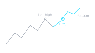
When price breaks the last key high in an uptrend or the last key low in a downtrend. It shows the trend is continuing.
Example: In an uptrend price closes above the last high at 64,000: that is a break of structure to the upside.
Indicators
RSI, MACD, moving averages and other chart helpers.
Technical indicator
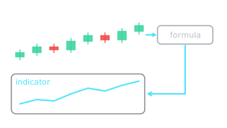
A formula that turns price or volume into an extra line or number. It helps you see trend or strength, but it does not predict the future.
Example: Some indicators are drawn on the candles themselves, like a moving average; others sit in a separate panel under the chart, like RSI.
Period
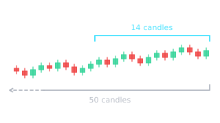
How many recent candles an indicator uses in its calculation, e.g. RSI 14 or a 200-period average. A short period reacts fast, a long one shows the overall direction.
Example: On the daily chart a 200-period average covers roughly the last 200 days, so it moves slowly and shows the long-term trend.
Moving average (MA, SMA, EMA)
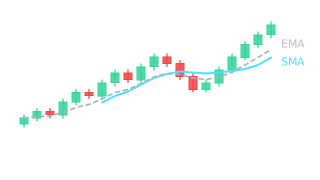
The average price over a chosen number of periods, drawn as a line on the chart. SMA weights all candles equally, EMA gives more weight to the latest ones.
Example: When price stays above the 50-day average and bounces off it every time, the average acts as moving support.
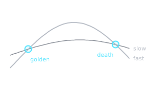
A crossover is when a faster line crosses a slower one. A golden cross forms when the 50-day average crosses above the 200-day average, a death cross when it crosses below.
Example: A golden cross often appears when price has already risen a lot, because averages lag.
Lagging and leading indicators
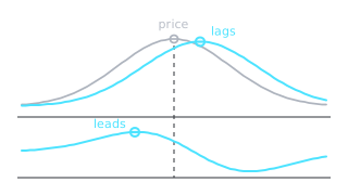
Lagging indicators, like moving averages, confirm a move that has already started. Leading ones, like RSI, try to show fading strength earlier but are wrong more often.
Example: A moving average crossover shows up after price has already turned: that is a lagging signal.
Oscillator
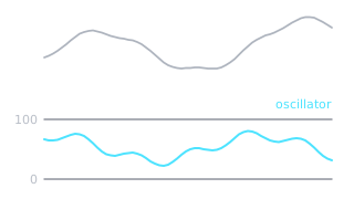
An indicator that moves between fixed limits, like RSI from 0 to 100. It sits in a separate panel and helps you see whether a move is overheated.
Example: Under the chart you see the RSI line: it climbs toward 70 when price rallies fast and falls toward 30 when price drops fast.
RSI (Relative Strength Index)
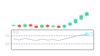
An oscillator from 0 to 100 showing the strength of price moves. It is usually calculated from 14 candles; above 70 is overbought, below 30 is oversold.
Example: After several big green candles RSI rose to 78: the rally is strong but already stretched.
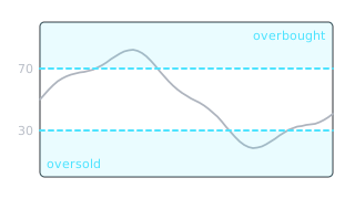
Overbought: price rose so fast it may pull back (RSI above 70); oversold: it fell so fast it may bounce (RSI below 30). It is a warning, not a command to buy or sell.
Example: In a strong uptrend RSI can stay above 70 for weeks while price keeps rising.
Momentum
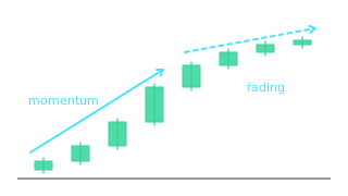
How strongly and quickly price moves in one direction. Long bodies and sharp moves show strong momentum, while shrinking candles show it is fading.
Example: At the start of a rally the candles are long, near the top they get shorter and shorter: momentum is fading even though price is still rising.
MACD
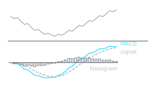
A momentum indicator built from the difference between two moving averages. It has the MACD line, a slower signal line and bars (the histogram) showing the gap between them.
Example: When the MACD line crosses above the signal line and the histogram bars turn positive, upward momentum is building.
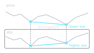
When price and an indicator disagree, e.g. price falls below its previous low but RSI does not. It is a sign the move is losing strength.
Example: Price fell below its previous low, but this time RSI made a higher low: that is bullish divergence.
Bollinger Bands
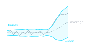
Three lines: the middle one is a 20-period average, and the upper and lower ones move further from it the more price has been swinging lately. When swings grow, the bands widen.
Example: Price touches the upper band several times and still rises: in a strong trend price can ride along the band for a long time.
Squeeze
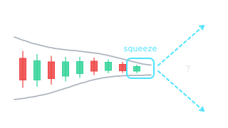
When the Bollinger Bands get very narrow, swings have died down. A strong move often follows such calm, but its direction is not known in advance.
Example: For a week the bands keep narrowing and the candles are small: when one long candle breaks out of the band, a new move begins.
OBV (On-Balance Volume)
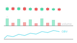
A line that adds up volume: a candle's volume is added when it closes above the previous close and subtracted when it closes below. It shows whether volume backs the rise or the fall.
Example: Price is flat while OBV rises: more volume trades on up days than on down days.
ATR (Average True Range)
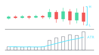
Shows how far price travels from low to high within one candle on average, usually over 14 candles. The higher the ATR, the further from entry the stop has to go.
Example: If the daily ATR is 2,000, a stop only 300 away from entry will likely be hit by normal noise.
Stochastic oscillator
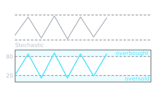
An oscillator from 0 to 100 showing where the close sits between the low (0) and the high (100) of the last 14 candles. Above 80 is overbought, below 20 oversold.
Example: In a range, Stochastic climbs to 80 near the top of the range and drops to 20 near the bottom.
ADX (trend strength)
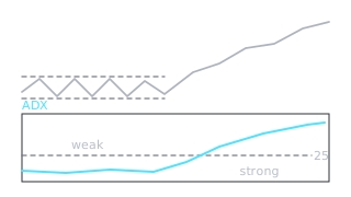
An indicator from 0 to 100 showing trend strength but not direction. Above 25 the trend is considered strong, below 20 weak.
Example: ADX is at 12 while price bounces between two levels: there is no clear trend.
Ichimoku Cloud
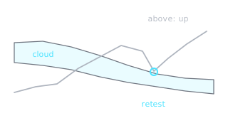
A Japanese indicator made of five lines and a cloud. Price above the cloud shows an uptrend, below it a downtrend, inside it no clear direction.
Example: Price rose above the cloud and retested it from above: the cloud is acting as a support zone.
VWAP (volume-weighted average price)
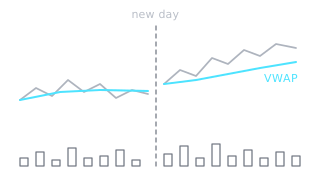
The day's average price where prices with more volume carry more weight. It usually starts over at the beginning of each day.
Example: When price holds above VWAP all day, traders who bought that day are in profit on average.
Parabolic SAR
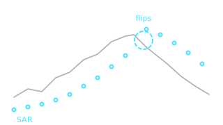
Dots above or below the candles: below price they show an uptrend, above price a downtrend. You can keep moving your stop to the dots as price moves in your favor.
Example: The dots sat below the candles for a long time, then one day jumped above them: the trend may be changing.
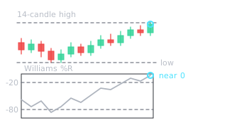
Williams %R
An oscillator from 0 to -100, very similar to Stochastic. 0 to -20 is overbought, -80 to -100 is oversold.
Example: When price closes near the high of the last 14 candles, Williams %R is close to 0.
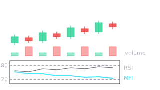
Money Flow Index (MFI)
An oscillator from 0 to 100, similar to RSI but calculated from both price and volume. Above 80 counts as overbought, below 20 as oversold.
Example: Price rises, but the up candles have low volume and the down candles high volume: MFI stays below RSI because volume is not backing the rise.
Risk management
How much to risk, where to put the stop and how not to lose the account.
Position: long and short
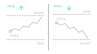
A position is an open trade: a long profits when price rises, a short when price falls. Shorts are usually opened with futures.
Example: In a short the stop goes above the entry and the target below, because you earn when price falls.
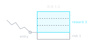
How much you can lose compared with how much you can gain: R:R 1:3 means you risk 1 to make 3. Then you can lose more often than you win and still come out ahead.
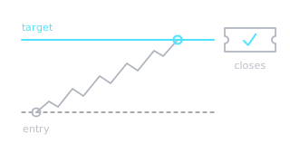
Example: Entry 100, stop 98, target 106: risk 2, potential gain 6, so R:R is 1:3.
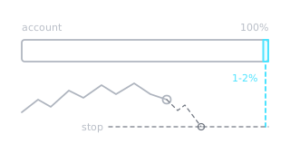
What percentage of the account you would lose if the stop is hit. The usual rule is no more than 1-2 %, so a few losses in a row cannot wreck the account.
Example: Account 5,000 USD, risk 2 %: if the stop is hit you lose no more than 100 USD.
Position size
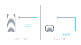
How much money you put into one trade. It is calculated from your risk and the distance to the stop: the further the stop, the smaller the position.
Example: You risk 100 USD and the stop is 5 % from entry: the position can be 2,000 USD, because 5 % of 2,000 is 100.
Leverage
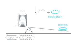
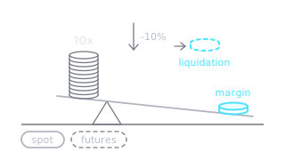
Borrowed funds that let you open a bigger position than your own money allows. Leverage magnifies profit and loss equally.
Example: With 10x leverage a 5 % move against you costs roughly 50 % of your margin.
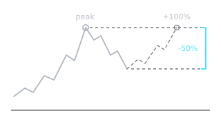
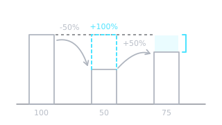
How far the account has fallen from its peak, usually in percent. After a 50 % drawdown you need a 100 % gain just to get back to where you were.
Example: The account grew to 12,000, then fell to 9,000: the drawdown is 25 %.
Diversification and correlation
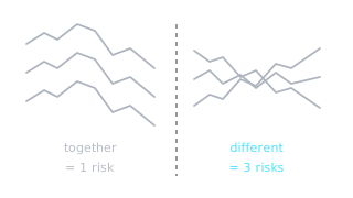
Diversification: you spread money across several different holdings. It helps little if they all move together, that is, if they are highly correlated.
Example: You hold positions in five smaller coins and BTC drops 10 %: all five often fall, so that is one big risk, not five small ones.
Black swan
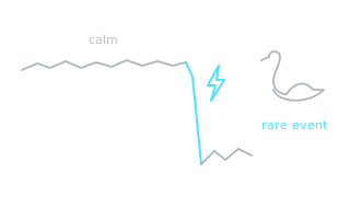
A rare, unexpected event with a huge impact on prices, like an exchange collapse or a pandemic. It cannot be predicted, so risk is limited in advance.
Example: In March 2020 BTC roughly halved in two days: on the daily chart these are huge red candles nobody saw coming.
Cash reserve
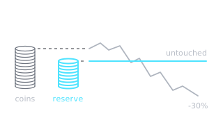
Part of your money kept uninvested, e.g. in stablecoins. It lets you sit through drops calmly without being forced to sell at a bad time.
Example: When price suddenly drops to strong support, a reserve lets you act on your plan without selling other positions.
Trailing stop
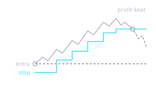
A stop that follows price in your favor and never moves back. It lets profit grow and locks in most of it when price turns.
Example: You enter at 100 with a 5 % trailing stop. Price rises to 120, the stop moves up to 114.
Win rate and expectancy
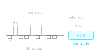
Win rate shows what share of trades end in profit, and expectancy shows how much you make or lose per trade on average. Win rate alone tells you nothing.
Example: You win 4 trades out of 10: each win makes 3 and each loss costs 1, so over 10 trades you gain 12 and lose 6, leaving 6 profit.
Trading plan and journal
A plan sets the entry, stop, target and position size in advance. In a journal you record every trade so you can see which mistakes you repeat.
Example: Before you click buy, write down where you enter, where the stop and target are, and why. If you cannot see that on the chart, there is no trade.
Hedge
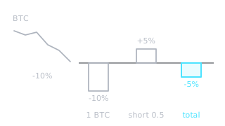
A position in the opposite direction that lowers overall risk, e.g. you hold BTC and open a small short. It reduces both loss and potential gain.
Example: You hold 1 BTC and open a 0.5 BTC short: if price falls 10 %, your total loss is roughly halved.
Portfolio exposure
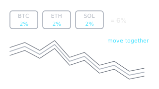
How much of your account is at risk across all your open positions at once. Several positions in coins that move together are really one big risk.
Example: Three open positions at 2 % risk each mean a bad day can cost 6 % of the account.
Kelly criterion
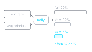
A formula that calculates position size from your win rate and the ratio of average win to average loss. The full size it gives is often too risky in practice.
Example: If the formula says 20 % of the account per trade, many people use only a quarter or half of that.
Recovery math
How many percent you need to gain to recover from a loss. After a 20 % loss you need 25 %, after 50 % you need 100 %, after 80 % a full 400 %.
Example: The account fell from 10,000 to 5,000: to get back to 10,000 you have to double what is left.
Break-even stop
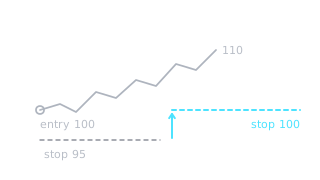
A stop moved to the entry price once price moves in your favor. From then on the worst case is losing only the fees, unless price jumps past the stop.
Example: You entered at 100, price rose to 110 and you moved the stop to 100: at worst you exit without a loss.
Isolated and cross margin
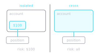
In isolated mode you only risk the margin assigned to that position. In cross mode the whole account balance is the collateral, so you can lose more.
Example: In an isolated position with 100 USD margin, liquidation costs you 100 USD, not the whole account.
Trade execution
How to place an order correctly and not overpay.
Order
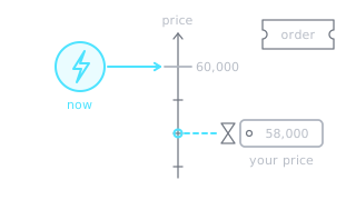
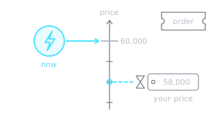
Your instruction to the exchange to buy or sell a set amount. The main types: a market order fills at once, a limit order waits for your price.
Example: Other people's limit orders wait on the exchange, and your market order fills right away at the best price they offer.
Limit order
An order to buy or sell only at your price or better. The price is guaranteed but the fill is not: if the market never reaches your price, the order just waits.
Example: You placed a limit buy at 2,900 support, but price turned at 2,920: the order did not fill.
Stop orders (stop-market and stop-limit)
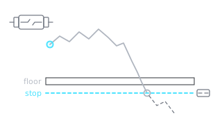
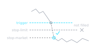
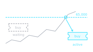
An order that activates when price reaches a set level. A stop-market then fills at any price, while a stop-limit fills only at your limit or better.
Example: In a sudden crash a stop-limit may not fill if price jumps past your limit, which is why stop-market is more common for stops.
Fill
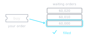
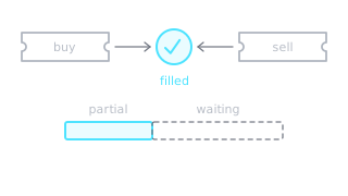
When your order meets the other side and the trade happens. If only part goes through, that is a partial fill and the rest keeps waiting.
Example: You wanted to buy 1 BTC at 60,000, but only 0.4 BTC was offered at that price: 0.4 filled, the rest is waiting.
Slippage
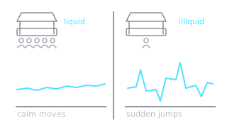
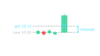
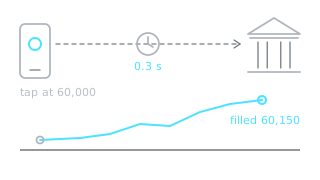
The difference between the price you saw and the price your trade actually got. It is bigger in fast moves and on illiquid coins.
Example: The screen showed 10.00, you bought with a market order and got filled at 10.12: slippage of 1.2 %.
Bid and ask
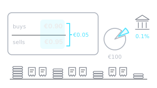
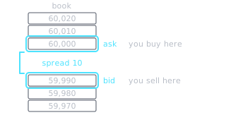
The bid is the highest price someone will pay right now, and the ask is the lowest price someone will sell for. The gap between them is called the spread.
Example: Bid 59,990, ask 60,000: a market buy pays 60,000, a market sell gets 59,990.
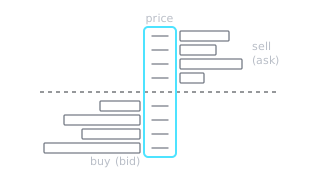
Order book
A list of all waiting buy and sell limit orders by price. It shows how much buying and selling interest sits at each price.
Example: In the book you see a big buy wall at 58,000, but it can vanish at any moment because orders can be cancelled.
Maker and taker
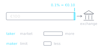
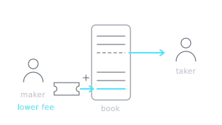
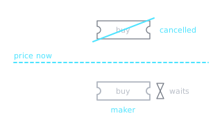
A maker leaves a limit order in the book and adds liquidity, while a taker fills an order at once and takes liquidity. The maker fee is usually lower.
Example: A limit order below the current price waits in the book: when it fills you are the maker and pay the lower fee.
Time in force (GTC, IOC, FOK)
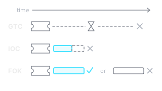
How long an order stays active. GTC waits until you cancel it, IOC fills what it can at once and cancels the rest, and FOK fills in full right away or not at all.
Example: A GTC limit order at support can wait for days until price comes down to it.
OCO order
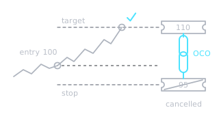
Two linked orders, usually a stop and a profit target. When one fills, the other is cancelled automatically.
Example: You entered at 100 and set an OCO: stop 95, target 110. Price hit 110, so the stop was cancelled automatically.
Entry and exit
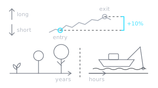
Entry is the price where you open a position, exit is the price where you close it. A good entry is planned in advance at a clear level, not by chasing price.
Example: In an uptrend, entering near support lets you place the stop close, while entering at the top forces it far away.
Pullback
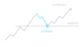
A short move against the main trend, after which the trend continues. In an uptrend it is a temporary dip back to support.
Example: After a rally from 50 to 60, price dips to 56, near the old resistance, and rises again: that is a pullback.
Stop hunt
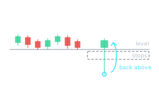
A sudden price spike past an obvious level where many stops are clustered, then a quick return. On the chart it looks like a long wick past the level.
Example: Lots of stops sit under 3,400 support: price briefly drops to 3,350, the stops fire, and the daily candle closes back above 3,400.
Gap and weekend trading
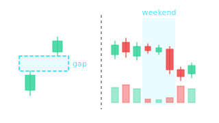
A gap is empty space between two candles when price opens far from the previous close. Crypto trades around the clock, but liquidity is thinner on weekends.
Example: On a Sunday evening in a thin market, one larger wave of selling can push price down several percent with no news at all.
Discipline and daily loss limit
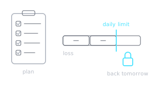
Discipline is sticking to your plan even when you feel the urge to change it. Daily loss limit: once you hit a preset loss, you stop trading for the day.
Example: After two stops in a row you see another signal, but your daily limit is reached: you close the chart and come back tomorrow.
Funding rate
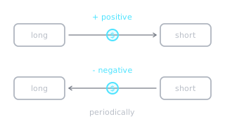
A periodic payment between longs and shorts in perpetual futures. When it is positive longs pay shorts, when negative the reverse.
Example: If the funding rate stays very positive for a long time, the market is crowded with leveraged longs.